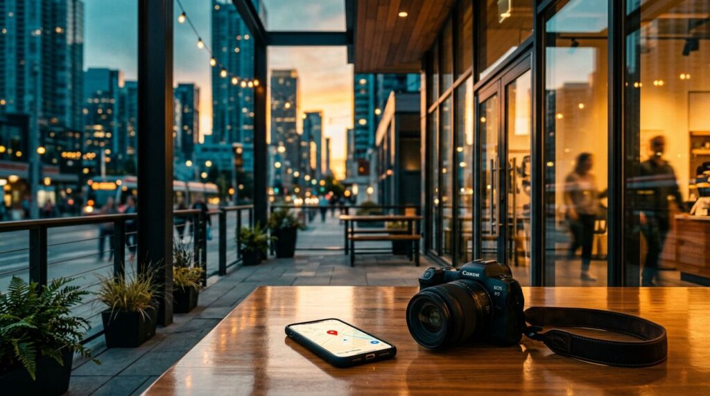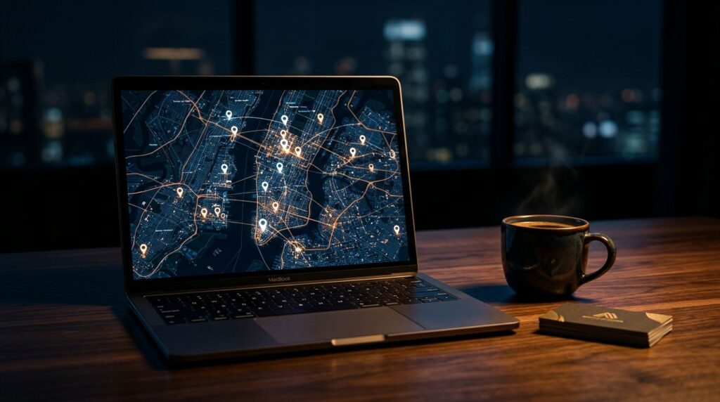
In 2026, Google Business Profile photos are less about decoration and more about proof. When someone finds us in Maps or the local pack, the photos often answer the real question first: do we look like a business worth visiting?
Google confirms the basics, like file types and image limits, but it does not turn weak visuals into a strong profile. If we want photos that support local SEO, we need real images, a smart mix, and a steady update habit. First, let’s separate what Google confirms from the myths that still hang around.
What Google actually confirms about profile photos
Google’s photo guidelines are pretty straightforward. JPG and PNG are fine. Files should stay between 10 KB and 5 MB. Square images around 720 x 720 work well, and other profile images need to fit their own crop shapes.
That part matters because a blurry, oddly cropped image does not build confidence. It also makes the profile feel unfinished. We do not need to overcomplicate it, but we do need to stay inside the lines.
What Google does not confirm is that photos alone push us up the rankings. That myth keeps floating around because photos do help performance, just not in a magic-button way. Better photos support trust, clicks, calls, and visits. That is where the real value sits.
When we want the whole profile to work harder, our Google Business Profile SEO strategy needs more than images. It needs accurate business details, strong reviews, useful services, and a profile that looks active. Photos support that larger picture.
A profile can be accurate and still feel empty. Photos fill in the part customers want to see.
If we are still getting the basics in order, our local SEO for beginners guide is a good starting point before we build the photo library.
The photo mix that earns clicks and visits
The best photo set feels like a quick tour. It shows the outside, the inside, the people, and the work. That is what helps a searcher move from curiosity to action.
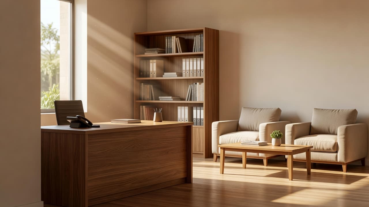
Exterior shots answer the first question fast. Can we find the place? Is the entrance clear? Is there parking? Interior shots do the next job. They show cleanliness, comfort, and whether the space feels cared for.
Here’s the mix we want to build first.
| Photo type | What it should show | Why it matters | What to avoid |
|---|---|---|---|
| Exterior | Front entrance, signage, parking, street view | Helps customers recognize the location | Cropped signs, empty dark facades |
| Interior | Reception, seating, service area, counters | Builds trust before a visit | Messy desks, dull lighting |
| Team | Real staff, friendly faces, working context | Makes the business feel human | Stiff poses, stock-like group shots |
| Services or products | What we sell, fix, install, or prepare | Shows what customers can expect | Random close-ups with no context |
| Before and after | Clear improvement, same angle, same space | Works well for result-based services | Misleading edits or mismatched framing |
The table is simple on purpose. We do not need 40 photo types. We need the right few.
If one image has to work hardest, make it the exterior. People want to know where to enter, where to park, and whether they are in the right place. Then we add the interior, the people, and the work itself. That is how a listing starts to feel real.
How to size, name, and organize files without overthinking it
File hygiene matters because messy images usually lead to messy habits. We do better when the photo library is easy to sort, easy to reuse, and easy to refresh.
The simplest way to avoid bad crops is to match the image to the job.
| Asset | Working size | Shape | Best use |
|---|---|---|---|
| Logo | 720 x 720 | Square | Brand identity |
| Cover photo | 1332 x 750 | Wide | First impression |
| Post photo | 1200 x 900 | Wide | Updates, offers, announcements |
| General minimum | 720 x 720 | Square | Clean uploads across devices |
These sizes keep the image cleaner across phones and desktops. For a second reference on upload basics, BrightLocal’s photo guide covers the same core dimensions in a practical way.
File names matter too, even if they are not the star of the show. We should rename images with plain English before uploading them. Something like northside-plumbing-truck-exterior.jpg is a lot better than IMG_4821.jpg. It keeps our team organized and helps us find the right asset later.
We should also keep the important part of the image near the center. Small screens crop fast. A face near the edge, or a logo tucked into a corner, can disappear.
When our website and profile details need to stay aligned, local business schema markup helps keep the broader local SEO signal clean. Photos still do their own job, but the whole profile works better when the full picture matches.
User-generated photos, review photos, and before-after examples
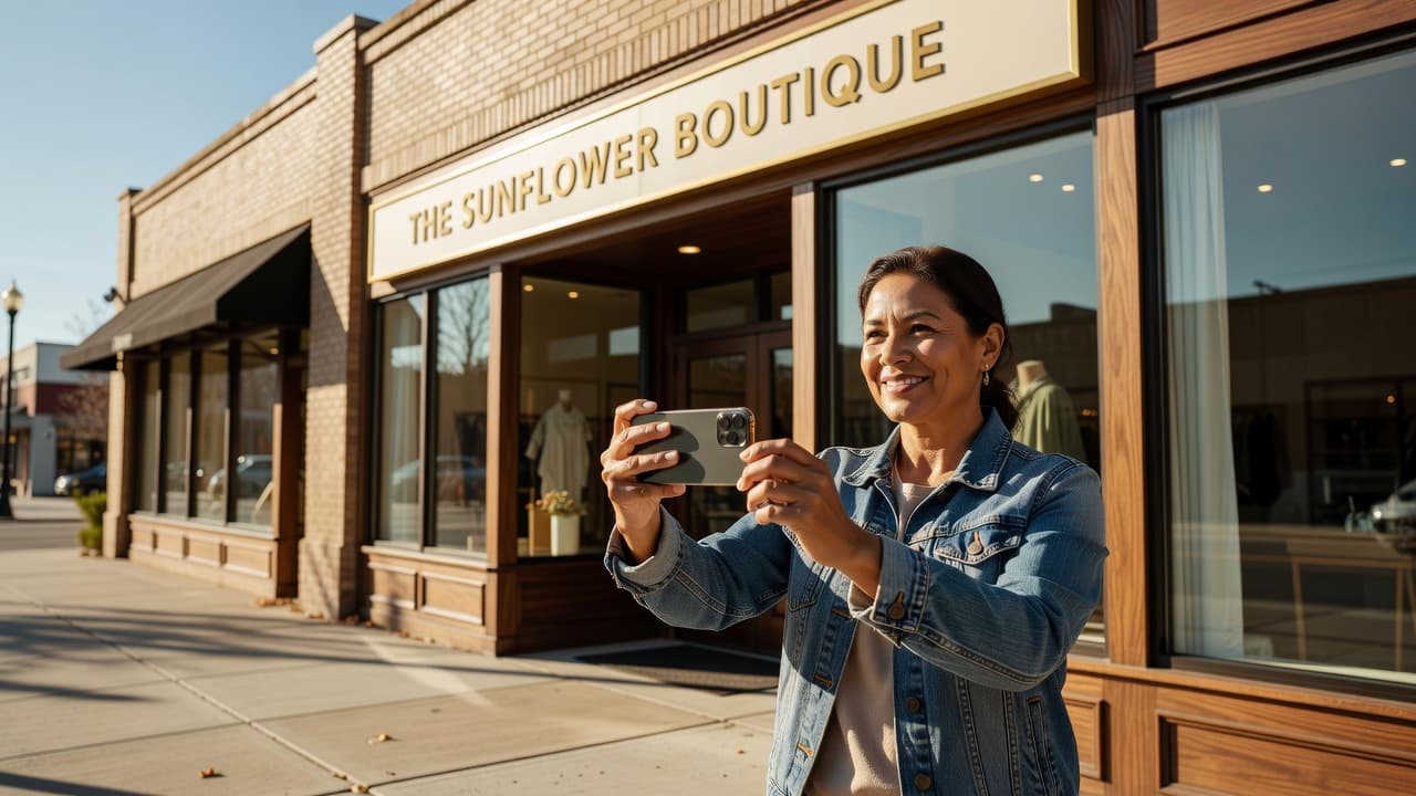
Not every useful photo comes from our camera. Customer-uploaded photos and review photos add a layer of social proof that polished brand shots cannot fake.
We should welcome those images, not ignore them. A happy customer with a photo of the finished job tells a better story than a generic slider image ever could. If a customer shares a real shot, that image often feels more believable than our best marketing photo.
This is also where team and location shots pull their weight. A clean front desk, a service bay, a waiting room, or a consultation area shows how we work. People do not want a mystery. They want a quick visual check that says, “Yes, this place is real.”
Before-and-after photos are especially useful for remodelers, cleaners, landscapers, med spas, and other result-based businesses. The rule is simple. Keep the angle honest, keep the lighting fair, and keep the framing consistent. If the change looks staged, the photo works against us.
A good before-and-after set does three things at once:
- It shows the problem clearly.
- It shows the result without confusing edits.
- It gives the customer a reason to believe we can do the same work for them.
A real customer photo can say more than a perfect brand shot.
We can also encourage review photos with a simple follow-up after the job. Nothing pushy, nothing scripted. Just a friendly request to share a photo if they have one. That small step can add a lot of trust over time.
A simple update rhythm keeps the profile fresh
A profile filled once and forgotten starts to feel stale. We do better with a small, steady routine.
A good rhythm looks like this:
- Add a few new photos each week from real jobs, real visits, or real team activity.
- Replace one outdated exterior or seasonal image each month.
- Ask happy customers for a photo when the project is finished.
- Remove blurry, duplicate, or off-brand images we control.
- Refresh location shots when the space changes.
That pace is manageable, and that matters. Most local businesses do not need a giant photo campaign. They need consistency. A few new images every week tell customers that the business is active and current.
Seasonal businesses should adjust faster. An HVAC company should not rely on summer-only visuals in January. A landscaping company should not leave snow-covered yard shots up all year. The profile should match the season people are living in right now.
We should also pay attention to what gets more action. Calls, direction taps, website visits, and booking clicks tell us whether the profile is doing its job. If a new batch of photos gets better engagement, we keep that style and expand it.
Conclusion
Google Business Profile photos are not decoration. They are proof.
When we show the outside, the inside, the team, the work, and real customer images, we give people fewer reasons to hesitate. That is the point. In 2026, the strongest photo set is the one that feels current, honest, and easy to trust.
If we keep the images real and keep updating them, the profile has a much better chance to convert the searcher who is already looking for a reason to call.